
Figure 1: How 10pt Times Roman looks at 600, 300, and 96 DPI.
Font rasterisation is, in the author’s opinion, one of the most interesting fields of computer science. If music is the subjective application of physics, then font rasterisation is almost certainly the subjective application of computer science. The purpose of this article is threefold: firstly, to provide an introduction into the various methods available to aid in the rasterisation process; secondly, to provide a critical analysis of these methods against the needs of desktop applications; and finally, to relate this analysis to free software.
Figures, in the form of bitmap images, are used extensively throughout. This is done to ensure consistent results across different platforms. Since some of the figures make use of sub-pixel rendering, this article is best viewed on an LCD screen.
Before we start exploring the various methods used in font rasterisation, it is important to first understand why rasterisation is so difficult. Why should rasterisation on a computer screen be any more complicated than on a printer? It all comes down to resolution. Or, more precisely, the number of dots per inch (DPI).
Printers typically start at around 300 DPI, with 600 DPI not being uncommon. This means that for every inch (2.54cm), there are potentially 300+ individual dots. Fonts, however, are not measured in dots but instead in points: 1/72 of an inch. A direct consequence of this is that a specific font at 10pt will have the same physical dimensions irrespective of the DPI at which it is rasterised.
Whereas printers have a relatively high DPI, computer screens are typically assumed to be at 96 DPI, over three times lower. Herein lies the difficulty with on-screen rasterisation. This is best illustrated with an example: Figure 1 shows the letter ‘M’ in 10pt Times New Roman at 600, 300, and 96 DPI, respectively. Looking at the figure, it is clear that 96 DPI is not sufficient to preserve the shape—or letter-form—of the glyph.
Figure 1: How 10pt Times Roman looks at 600, 300, and 96 DPI.
This phenomenon can be explained using information theory. Since glyphs contain information it is possible to view them as a signal comprised of various frequencies. The Nyquist–Shannon sampling theorem states that in order to accurately reproduce a signal, the sampling rate needs to be at least twice the maximum frequency of the signal. Should the sampling rate be lower than this, then distortions—in the form of aliasing—will be introduced. In the case of rasterisation, the sampling rate corresponds directly to the DPI of the output device.
An example of aliasing as a consequence of low DPI can be seen in Figure 2.
Figure 2: 10pt Times New Roman at 96 DPI. Note how some stems are thicker than others, and how certain features are under-/over-emphasised.
Since it is clear that 96 DPI is insufficient for accurate rasterisation, we are left with two options. The first is to find a way of increasing the effective sampling rate of the device, while the second is to reduce the frequency of the glyphs to allow the use of a lower sampling rate. All of the methods presented in this article fall into one of these two categories.
One of the oldest and mostly widely used techniques for improving rasterisation quality is font hinting. Also known as grid fitting, hinting involves modifying the shape of glyphs in order to ensure they line up with the rasterisation grid. By distorting the glyph so that it is aligned with the pixel grid, the overall frequency is reduced. An example of font hinting can be seen in Figure 3.
Figure 3: 10pt Times New Roman at 96 DPI with (bottom) and without (top) hinting. Also note the differing widths between the hinted and un-hinted text.
The hinted text is much more consistent than its un-hinted counterpart. However, this consistency comes at the price of accuracy. An unavoidable consequence of warping glyphs to the rasterisation grid is that their dimensions change slightly. These small differences quickly add up over a line of text resulting in a visible difference—such as that seen in Figure 3. The author refers to this phenomenon as character drift.
The degree of hinting required to produce consistent output is dependent on the DPI of the output device; low resolution devices require more aggressive hinting than high resolution device. One of the consequences of aggressive hinting—necessary as it may be—is character drift. At resolutions in excess of 300 DPI, it is possible to forego font hinting entirely.
Font hinting is usually achieved through one of two approaches. The first of these puts the font designer in control of the hinting process. This is the approach taken by the TrueType font specification—without a doubt the most widespread font format. In the specification, a virtual machine is used to instruct the rasteriser on how to go about rendering a glyph. This, in theory, gives designers pixel level control over how glyphs are rasterised at various sizes Tur01a. The second approach is to leave hinting up to the font rasteriser—so called auto-hinting. When rendering non-TrueType fonts—such as those in Adobe’s Type 1 format, or those that lack hinting instructions—this is often the only option Tur01a.
In order for a meaningful comparison to be made between these approaches, it is first necessary to have an understanding of some of the other techniques available for improving rasterisation quality.
So far, we have been assuming that pixels are bi-level, either on or off, black or white. However, modern computer screens are capable of displaying millions of colours, including shades of grey. Font rasterisers are able to take advantage of this by using a technique called anti-aliasing. As the name would suggest, anti-aliasing is a means of avoiding the unwanted effects of aliasing when sampling a high-frequency signal on a low-frequency device. This is done by blurring the signal; its effect is to reduce its maximal frequency.
Pixels of anti-aliased text are multi-level. That is, they can be black, white, or a shade of grey. The shade of a pixel depends on the percentage of the pixel that is masked by the glyph. This concept is neatly demonstrated in Figure 4.

Figure 4: The letter ‘g’ in 10pt Times New Roman at 672 DPI (left) and 96 DPI (right). The right glyph has been rendered with a (primitive) anti-aliasing algorithm and scaled by a factor of 7.
The effect of anti-aliasing on a line of text can be seen in Figure 5. Anti-aliasing does a very good job at preserving the shapes of glyphs. Moreover, the anti-aliased text does not suffer from character drift. However, this accuracy comes at the sacrifice of clarity—the anti-aliased text has a much lower contrast than its hinted counterpart.
Figure 5: 10pt Times New Roman at 96 DPI; without anti-aliasing or hinting (top), with hinting (middle), with anti-aliasing (bottom).
Both hinting and anti-aliasing improve the legibility of text at low resolutions by making it more consistent. Hinting does this at the cost of accuracy, while anti-aliasing does it at the cost of contrast. At this point, the logical question to ask is “can hinting and anti-aliasing be used in conjunction with each other?” The answer is yes—with the appropriate finesse, it is possible to hint anti-aliased text.
In principle, hinting anti-aliased text is exactly the same as hinting monochromatic text. However, in practice, a different implementation is required in order to produce high-quality output Tur01b. The practicality of this depends on the hinting approach taken; it is significantly easier when the hinting is performed by the font rasteriser instead of a virtual machine. Indeed, naïvely combining TrueType hinting with anti-aliasing can often result in a reduction in overall consistency! This is most readily observed when rendering sans-serif fonts, as can be seen in Figure 6.
Figure 6: 10pt Arial at 96 DPI; with TrueType hinting (top), with anti-aliasing (middle), with TrueType hinting and anti-aliasing (bottom).
While the output is legible, it lacks consistency—some characters, such as ‘w’ and ‘s’, are anti-aliased, while others, such as ‘l’, are not. This causes some characters to appear to be heavier than others. These heavier characters are often referred to as being dirty. The undesirable characteristics apparent in Figure 6 arise because the anti-aliased text is being hinted as if it were regular monochromatic text. (Which, incidentally, is why the application of anti-aliasing has no effect on the overall character drift.) But as was established in the previous section, anti-aliased text has a lower frequency than monochromatic text. The solution, therefore, is to use less aggressive hinting. This is quite difficult to accomplish when using TrueType hinting, as the virtual machine does not provide sufficient control over the hinting process. However, when auto-hinting is used, this becomes a very real possibility.
Figure 7 shows the auto-hinting styles provided by FreeType—a popular font rasterisation library used by many free software applications.
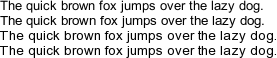
Figure 7: 10pt Arial at 96 DPI rendered with various hinting styles; from top to bottom: none, slight, medium and full. It should be noted that, in this particular instance, medium and full yield identical results.
Of the auto-hinting styles provided by FreeType, the slight style is perhaps the most interesting. Unlike medium and full, it incurs no character drift whatsoever, while still providing an improvement over regular anti-aliasing. Whereas most algorithms hint both the x- and y-axes, the slight style hints just the y-axis. As character drift is caused by cumulative error in glyph dimensions, it can only occur as a result of x-axis hinting; hence, by just hinting the y-axis, it is possible to eliminate character drift entirely. The more aggressive hinting styles, medium and full, compare quite favourably to TrueType hinting for many fonts.
By appropriately combining font hinting with anti-aliasing it is possible to obtain the best of both worlds.
So far, all of the techniques we have considered have worked by decreasing the spatial frequency of the text. Sub-pixel rendering, also known as sub-pixel anti-aliasing, is a means of increasing the effective resolution (DPI) of an LCD screen by taking advantage of the way sub-pixels are arranged.
A single pixel on an LCD screen is composed of red, green, and blue sub-pixels in a fixed order, usually RGB. Sub-pixel rendering works by exploiting this fixed arrangement to increase the effective horizontal resolution of the screen. This is made possible by the fact that our eyes are more sensitive to differences in luminance than in chroma. Therefore, two adjacent sub-pixels can have a perceptibly different intensity but an indistinguishable chroma (colour). However, this is only the case for a finite range of sub-pixel differences: too small and the intensities appear identical; too large and the differences in chroma become visible.
With respect to font rasterisation, the process is roughly as follows: The glyph is first rasterised at three times the horizontal resolution (treating sub-pixels as if they were bona-fide pixels), and then filtered—the purpose of which is to ensure the aforementioned constraints on sub-pixel intensity are satisfied. Finally, the filtered image is mapped onto the appropriate sub-pixels on the screen/output device. A more substantial explanation of how sub-pixel rendering works can be found in Gib98.
Figure 8: 10pt Times New Roman at 96 DPI with vertical hinting: plain anti-aliasing (top) and sub-pixel anti-aliasing (bottom).
As an aside, it is worth noting the distinction which exists between anti-aliasing and sub-pixel rendering. The use of sub-pixel rendering does not necessitate the use of anti-aliasing. Sub-pixel rendering works, and is effective, irrespective of whether the glyph being filtered has been rendered (at three times the width) with anti-aliasing or not. All of the examples in this section showcase sub-pixel rendering with anti-aliasing. An example of sub-pixel rendering with aliased glyphs can be seen in Figure 14 and Gib98. To further the confusion, the filtering process is in and of itself a form of anti-aliasing, meaning that post-filtering, all sub-pixel rendered text is anti-aliased (and hence is described by some authors as colourised anti-aliasing).
While researching for this article I discovered many users—predominantly in the free software community—who prefer to disable sub-pixel rendering in lieu of regular anti-aliasing. The overwhelming majority do so because of a distracting and unwanted phenomenon called colour fringing. This can be seen in Figure 9. Notice how the edges of characters appear coloured.
Figure 9: 10pt and 12pt Times New Roman at 96 DPI rendered without filtering—causing severe colour fringing.
Colour fringing occurs as a result of improper or insufficient filtering. As outlined in the previous section, filtering is necessary to normalise the difference between adjacent sub-pixels so that they lie within a certain range. If no filtering is performed, as in Figure 9, then large differences between sub-pixels can arise. An example of this can be seen by looking at the 12pt letter ‘f’ in Figure 9—its left side appears yellow. This is because the rightmost (blue) sub-pixel is masked by the stem of the glyph, leaving just the red and green sub-pixels illuminated. Since red and green combine to yellow, a colour fringe is observed.
The most common solution to this is to apply a finite impulse response (FIR) filter. This can be thought as a weighted moving average, whereby the intensity of a sub-pixel is a combination of it and its surrounding sub-pixels. The number of sub-pixels sampled—the number of taps—and the weights applied to these sub-pixels is implementation-specific. The differences between various FIR filters can be seen in Figure 10.
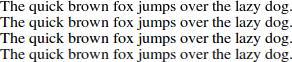
Figure 10: 12pt Times New Roman at 96 DPI. From top to bottom: regular anti-aliasing; a 3-tap FIR filter with coefficients [1/3, 1/3, 1/3]; a 5-tap FIR filter [1/16, 4/16, 7/16, 4/16, 1/16]; 5-tap FIR filter [1/9, 2/9, 3/9, 2/9, 1/9].
All three of the FIR filters in Figure 10 are successful in eliminating colour fringing. However, the contrast ratio of the text varies between filters—the 2nd filter (third line down) produces noticeably sharper text than the other two. This is due to the higher weight of 4/16 ≈ 0.44 carried by the central sub-pixel, compared with 1/3 ≈ 0.33 for the other filters, resulting in a greater difference between sub-pixel intensities, hence a clearer letter-form. In many respects, ~0.45 is an upper bound for the central sub-pixel, after which colour fringing becomes a real possibility. (For comparison, the unfiltered text in Figure 9 can be thought of as having coefficients [0, 0, 1, 0, 0].)
The three filters shown in Figure 10 were chosen because they can all be found in real-world applications. The first two are those provided by the FreeType library, where they are known as light and default, while the third filter is outlined in Gib98.
The FIR filter, as described above, is an inter-pixel filter; meaning that it operates on sub-pixels directly—oblivious to pixel boundaries. However, there exist another class of filters which do consider pixel boundaries. Such filters are known as intra-pixel filters. The primary difference between inter- and intra-pixel filters is that intra-pixel filters are only effective at filtering well-hinted text Rød08. This restriction severely limits the scope of intra-pixel filters and renders them unsuitable for many applications. Despite their technical inferiority, intra-pixel filters are still the default in many free software libraries—and hence are worthy of at least passing reference.
Since sub-pixel rendering relies on the precise arrangement of sub-pixels it is inherently anisotropic, i.e. it has a directional dependency. Therefore if either the text or the screen are rotated, its efficacy will be reduced.
For obvious reasons, rotated text in applications is relatively uncommon. However, many high-end monitors and mobile devices support rotation (so-called portrait mode). This rotation causes the sub-pixels to be stacked vertically along the y-axis instead of horizontally along the x-axis. While it is possible, with appropriate support from the rasteriser, to exploit the new sub-pixel arrangement, the effect is now in the vertical direction. This is much less effective and produces results similar to regular anti-aliasing with y-axis hinting.
Not to be confused with sub-pixel rendering, sub-pixel positioning is a generalisation of both anti-aliasing and sub-pixel rendering to permit the fractional placement of glyphs. Thus far, all of the glyphs we have looked at—including those rasterised with sub-pixel rendering—have started and ended on whole pixel boundaries.
One of the reasons why text rendered with anti-aliasing appears more detailed than monochromatic (black and white) text is because anti-aliasing allows for strokes (lines) to have a fractional width. This is achieved by varying the intensity of pixels, as shown in Figure 4. A consequence of this is that the spacing between strokes also becomes fractional. Hence, by adding small amounts of space to the left hand side of a glyph, it becomes possible to position it with sub-pixel accuracy. The degree of precision provided is implementation dependent. Although 1/3 of a pixel is sufficient for most applications, it is theoretically possible to provide a precision of 1/256 of a pixel.
Figure 11 shows the word “intelligent“ rendered with sub-pixel positioning. While all of the repeated characters (i, n, t, e and l) appear the same, they all, with the exception of n, have different pixel representations. This can be seen clearly in Figure 12.
Figure 11: 11pt Times New Roman rendered with sub-pixel positioning using Quartz―the 2D graphics library of Mac OS X.
Figure 12: Figure 11 scaled by a factor of 4.
The improved accuracy afforded by sub-pixel positioning translates into more consistent spacing between glyphs. However, as with sub-pixel rendering, there are a couple of important corollaries.
Interestingly, sub-pixel positioning does not necessitate the use of sub-pixel rendering. Indeed, the technique actually pre-dates the widespread adoption of sub-pixel rendering! However, sub-pixel rendering does provide a convenient means of shifting a glyph by either 1/3 or 2/3 of a pixel. By rasterising a glyph once—at three times the width—then, pre-filtering, inserting either one or two units of space to the left of the glyph, it is possible to produce all three sub-pixel variants. Such a technique has the desirable property of requiring no explicit support from the rasteriser and can even be used to sub-pixel position monochromatic text, hinted or otherwise.
Rendering a glyph is a computationally intensive operation. Therefore, most rasterisers save or cache the results of rendering a specific glyph at a specific size. However one of the consequences of sub-pixel positioning is that a glyph can have multiple pixel representations, with each representation requiring its own cache entry. This has the effect of both increasing the size of the glyph cache and reducing its efficiency. For example, a rasteriser supporting 1/3 pixel positioning would theoretically require three times as much memory than one not using sub-pixel positioning. It is thus important that rasterisers provide a sensible degree of precision.
Broadly, desktop applications can be divided into one of two categories: those that require freely scalable text and those that do not. Text is said to be freely scalable if its metrics are linear under scaling. Or, in other words, the positioning and spacing of glyphs is exactly the same on screen as on paper—irrespective of differences in DPI.
Freely scalable text is most commonly found in page layout programs, such as what you see is what you get (WYSIWYG) editors and document viewers. However, it is advantageous whenever the ability to zoom or scale parts of an application is desirable. (If the text were not freely scalable, then the positions of glyphs would need to be recomputed upon scaling.)
In the previous section on rendering techniques, a strong emphasis was placed on minimising character drift—and this is why. For text to be freely scalable, it can not be allowed to accumulate any character drift. Since character drift arises as a result of x-axis hinting the most general way to obtain freely scalable text is to avoid the use of x-axis hinting entirely. Assuming that the underlying font rasterisation library provides application-level support for configuring hinting, this method has the advantage of being extremely simple to implement. But in the case where regular application text is hinted, the use of this method results in freely scalable text having a different consistency to that of regular text, c.f. Figure 7.
Although many applications require freely scalable text, a sizeable proportion of them, especially word processors, require it only to ensure the consistency of line breaks, since the location of a line break should not depend on the zoom-level or DPI of the output device. The only requirement for this is that a given line of text not be allowed to accumulate any (inter-line) character drift; intra-line drift, however, is acceptable. This quasi scalable text can be obtained by adjusting the inter-word spacing of regular hinted text. For example, if a piece of text containing 10 words has a normalised width of 1.0, while the same piece of text rendered with hinting has a width of 1.05, then (1.05 - 1.0) / 10 = 0.005 units of space would be added between each word. The author, idiosyncratically, refers to these spaces as correctional deltas. Conceptually, the method presented above operates in a very similar fashion to primitive word justification algorithms. An in-depth analysis of the method can be found in Tay03.
In order for the method of correctional deltas to be applicable, it is necessary for the application, be it a word processor or document viewer, to have a concept of a line of text. For word processors this is no problem whatsoever; the task of breaking a block of text down into lines is trivial. However, many document formats, such as PDF and PostScript, have no such concept. It is not uncommon for text in such documents to be stored as a list of glyphs and (x, y) coordinates, with no logical order per-se. (Indeed, this is one of the reasons why text selection in PDF documents, especially those with columns, is so haphazard.) A consequence of this is that the method of correctional deltas is not universally applicable.
Both of the methods outlined above can be used to obtain attractive freely scalable text. However there is a third naïve method which due to its prevalence is also worth mentioning. The idea is to treat hinted text as if it possesses the same metrics as un-hinted text. This is done by precisely computing the un-hinted location of glyphs (usually at a very high DPI) and then using these accurate offsets to place regular hinted glyphs. As these hinted glyphs have different metrics it is not uncommon for there to be either too little or too much space between glyphs. This is readily evident in Figure 13b.
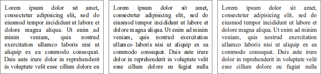
Figure 13: Side-by-side comparison of the place-holder text “Lorem ipsum…” in 10pt Times New Roman as rendered by the multi-line text edit control of the Qt library; a) Regular hinted text, not freely scalable; b) Hinted text naïvely positioned as if it were freely scalable; c) Y-axis hinted text, freely scalable.
From a purely technical standpoint, the only real legitimate use for naïvely positioned text is when the underlying font rasterisation library provides no support for rendering text without x-axis hinting.
Windows and Mac OS X take very different approaches to font rasterisation. It is hence poignant to go on a minor tangent to analyse these approaches.
The font rasteriser in Windows, which dates back to the early 90s, makes extensive use of font hinting. This is primarily done via the TrueType bytecode present in many fonts. Sub-pixel rendering has been supported through Microsoft’s ClearType technology, which was first introduced with Windows XP as a disabled-by-default configuration option. Several high-profile Microsoft products—including Internet Explorer 7 and Microsoft Office 2003 & 2007—take the liberty of automatically enabling ClearType on a per-application basis. With the release of Windows Vista in 2006, the status of ClearType changed from being disabled-by-default to enabled-by-default. In addition to this, Windows Vista also included, as part of the (.NET) Windows Presentation Foundation, an updated version of ClearType with support for freely scalable un-hinted text and sub-pixel positioning. Windows applications not using .NET are able to access this new ClearType revision through the DirectWrite API which is available for Windows Vista and later Mic09a. Since both of these technologies are very new and not well supported by older versions of Windows, many applications which require freely scalable text, including Adobe Reader, ship with their own font rasteriser and bypass ClearType entirely.
The approach taken by Mac OS X could not be more different, relying exclusively on un-hinted, freely scalable text. This is achieved through an intricate combination of anti-aliasing, sub-pixel rendering and sub-pixel positioning. Versions of Mac OS X prior to 10.6 “Snow Leopard” allowed users to configure the degree of anti-aliasing applied to on-screen text and also to disable sub-pixel rendering. With the release of 10.6 Apple removed most of these options in lieu of a “use LCD font smoothing when available” checkbox Mac09. Heuristics are used to automatically determine if a display device supports sub-pixel rendering or not.
A comparison of the Windows and Mac OS X rasterisers can be seen in Figure 14. It is interesting to see how two diametrically opposed approaches can both result in perfectly legible output.
Figure 14: 12pt Times New Roman at 96 DPI sub-pixel rendered with the Windows rasteriser (top) and the Mac OS X rasteriser (bottom).
When Apple first released their Safari web browser for Windows in June 2007, they included with it the font rasteriser from Mac OS X. Being a browser, Safari has no intrinsic need for freely scalable text; the choice to include a custom rasteriser was a decision stylistic—rather than technical—in nature.
This choice proved to be very controversial. Several bloggers, including Jeff Atwood Atw07 and Joel Spolsky Spo07, wrote posts on the subject, often with side-by-side comparisons of the Apple and Microsoft rasterisers. Not surprisingly, there was no general consensus as to which was the superior. Joel Spolsky best summarized the situation as:
Now, on to the question of what people prefer. Jeff Atwood’s post from yesterday comparing the two font technologies side-by-side generated rather predictable heat: Apple users liked Apple’s system, while Windows users liked Microsoft’s system. This is not just standard fanboyism; it reflects the fact that when you ask people to choose a style or design that they prefer, unless they are trained, they will generally choose the one that looks most familiar. In most matters of taste, when you do preference surveys, you’ll find that most people don’t really know what to choose, and will opt for the one that seems most familiar.
With the release of Safari 4.0 in June 2009, Apple switched to using Microsoft’s ClearType rasteriser by default.
The key idea here is consistency. For an application to be well received by users, it has to be consistent with other applications on the system. Apple, however, are not the only ones to fall short of user’s expectations for consistency; Microsoft themselves received some criticism for font rasterisation in WPF applications. Microsoft’s latest text API, DirectWrite, goes so far as to allow developers to disable new ClearType functionality, in order to remain consistent with legacy applications and widgets Mic09b.
Before performing an in-depth analysis into font rasterisation under GNU/Linux and other free software platforms, it is worth summarising what has been covered thus far.
At first glance, the text rendering stack under GNU/Linux and other free software platforms appears somewhat convoluted, with there existing a whole quorum of libraries related to font rasterisation. In this section, we will analyse the tasks performed by these libraries and the problems that can arise as a result of incorrect configuration.
On a modern GNU/Linux system the following packages have an influence over the rasterisation process.
The two most popular PDF viewers under GNU/Linux, Evince (GTK+, GNOME) and Okular (Qt, KDE), are both frontends to the Poppler PDF rendering library. However, despite this, the two applications sometimes produce very different output for the same document. This is because the Poppler library has two rendering backends: a legacy one derived from the Xpdf 3.0 codebase (referred to as Splash) as used by Okular, and a newer Cairo backend which is used by Evince. While the output produced by the Cairo backend is generally of superior quality to that produced by the Splash backend, it is not currently possible to access the Cairo backend from Qt due to ‘toolkit politics’ Cid09.
When rendering PDF documents on screen, it is necessary to use freely scalable text. This means that it is necessary to disable x-axis font hinting when rendering the document. However, for some reason unbeknown to the author, the Cairo backend for Poppler disables font hinting entirely, including y-axis font hinting—which is beneficial to rendering quality! Moreover, the renderer also disables sub-pixel rendering if enabled. For users or distributions that have chosen to enable sub-pixel rendering, this results in PDF documents being rendered in a sub-optimal fashion.
Patches are available both to make the Cairo backend available for Qt applications and to facilitate the use of y-axis hinting and sub-pixel rendering.
As was alluded to in the previous section the blind building and distribution of several upstream packages will result in output which, on many systems, is inconsistent and sub-optimal. Thankfully, all of the aforementioned issues can be rectified by patching the offending packages. The patches presented in this section have been tested extensively by both myself and others—with many already being carried by GNU/Linux distributions.
It is the hope of the author that these patches will eventually be merged upstream.
The following articles, although not referenced directly in the text, were found to be useful by the author while researching the topic of font rasterisation.
Most of the figures presented in this article were rendered by the FreeType backend to Cairo; with text layout being performed by the Pango layout library.